A great concept to be conscious of when you’re talking about lighting design in any aspect, whether you’re lighting a restaurant, a concert stage, or a video set, is color temperature. Color temperature is going to be most important when you’re talking about photography or videography, but can be used in any setting to help set a mood, or give a certain feel. Color temperature can be a little confusing to figure out at first, so we’re going to try to break it down.

If you’ve ever been to an Apple store, you’ve seen a good example of color temperature in lighting. Apple stores are always brightly lit with harsh white light, and it works for them, it matches the feel of their company. When you walk in this store it feels very cold and sterile, like you just walked into some sort of space ship. It usually has a totally different feel than any of the other stores you walk into, and that is in a very big way accomplished by their use of lighting.
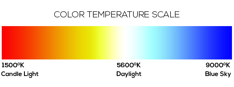
So we’ve seen an example of how color temperature is used, but we still don’t know exactly what it means, right? Basically there are a lot of colors of light that people would often lump into calling “white” light. An incandescent bulb in your house seems like white light, until you put it next to the fluorescent bulbs in the Apple store, then you realize just how yellow it is. There are many different types of light sources out there and they all have their own colors. To precisely describe the color of each light source (Without using terms like ‘sort of more yellow-ish-er”) we use degrees Kelvin (or K), this gives us an exact measurement of a color coming from a light source that we can then use to compare that source to other ones. The confusing part comes when you find out that this scale is set up opposite of what you would expect.
When we start talking about colors most people would agree that reds, yellows, and oranges would be considered “warm” colors, while blues and purples would be considered “cool” colors. In the Kelvin scale though, warm colors are going to rate LOWER on the Kelvin scale, while blues and other cool colors will rate HIGHER. Here’s a really simple scale, just to get a quick idea.
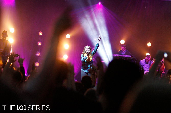
To help explain further the differences between different temperatures, take a look at this shot of our stage…
Here we see two different temperatures of “white” light. You can see lots of Source 4 PARs behind the singer, which have tungsten lamps that are around 3200K, and then you can see a bright white beam coming up behind her hand which is a Martin Mac250 Krypton, The Mac250’s lamp is about 8,000K. As you can see, the Mac250 has that bright, sterile, cold color of white that is similar to the color you would see in the Apple store, while the tungsten has the warm color of light that you would expect to see in a house or a restaurant, it has that warm, inviting feel to it. One thing to remember also, is that when dimming incandescent fixtures, your color temperature is going to drop the more that the bulb is dimmed, so a S4 PAR is going to look much more red when it is dimmed to 20% than when it is running at full.
These numbers become even more important when you start talking about videography or photography. A camera is much less forgiving than your eyes are, so you have to tell a camera what color is supposed to be white. If you are lighting a person with tungsten lights, your camera is going to see that as a little too yellow, and will actually tint the whole picture blue in order to correct it. If, however, you were lighting someone with the Mac 250, the camera would see that as a little too blue, and would tint it yellow to correct. Telling the camera what temperature your lighting is helps the camera to know the exact amount it has to tint the picture in order to make white become white. This is called “White balancing” the camera.
I’m not going to try to say that there are right or wrong ways to choose temperatures of lights, but there are things you can think about to make sure that nothing is done accidentally. If you’re using more than one color of light (like the way that I mixed the PARs and the Mac250s in the above photo) make sure you’re mindful of it, make sure that you know you’re doing it and that you’re working it into your design. This goes for all avenues of lighting, you would want to do the same thing when lighting a video set, or while doing interior design. The Apple store in our original example didn’t just happen to end up with the lighting that they did, someone planned it out to match the feel of their company and their advertising.
Color temperature can be a great tool to use no matter what your next lighting project is. Next time you are looking up specs of a fixture or buying new lamps take a look at what the temperature of them is and think about how that may influence your final project!